Start with the bake customers already want
A bakery brand does not exist separately from the food. The crumb, fruit, chocolate, icing and paper around the bake already give you a color story. When your shop borrows from that story, the link between an Instagram post and the place where someone orders feels natural.
The palettes below were computed by Confita’s photo-to-shop sampler from real bake photos. “Sampled” means the exact pixel colors it found. “Shop” means the three-color palette a shop built from that photo uses: a primary color, an accent and a page background. They are starting points, not rules. Keep the colors that make your bake feel like itself.
12 bakery palette ideas from real photos
Use the sampled swatches for inspiration or copy the shop swatches for a simple starting system.
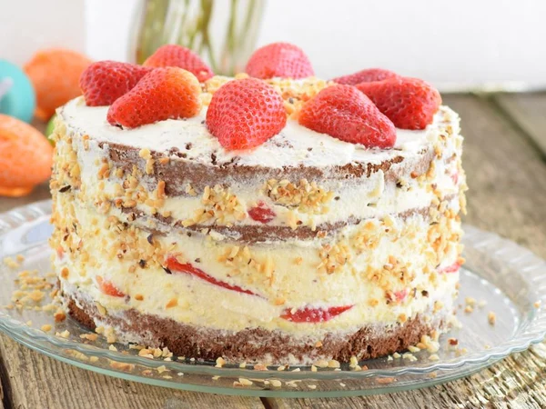
Strawberry cream cake
Sampled from the photo
- #DF574B
- #D1B78F
- #E2DCD4
- #7D4D34
- #8DD0D0
Shop palette
- #D43022
- #CAA772
- #FDF3F2
Warm, cheerful and softly fresh; it suits a cake shop built around fruit, cream and celebrations.
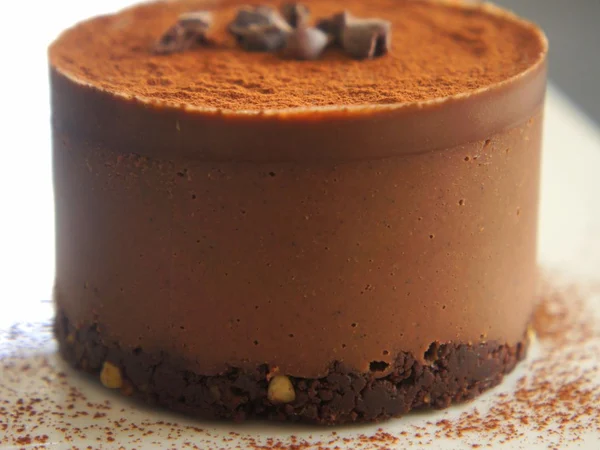
Chocolate mousse cake
Sampled from the photo
- #BB6E3C
- #78442B
- #CBB499
- #E6E2D5
Shop palette
- #A25E32
- #D59F7C
- #FAF5F1
Rich browns with a gentle blush accent; a good fit for chocolate, coffee and dessert-box menus.
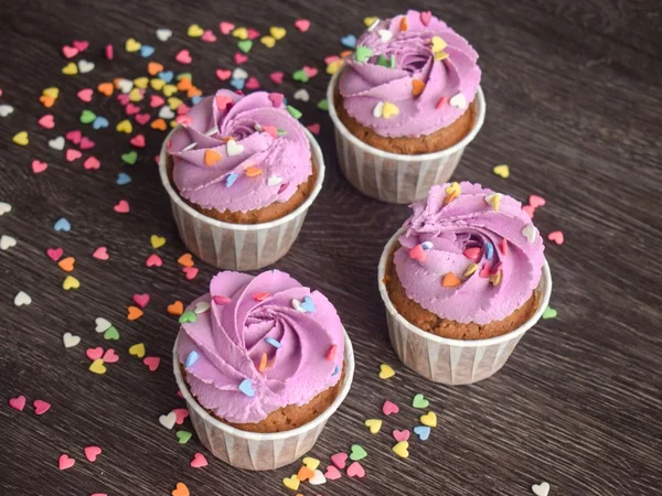
Pink buttercream cupcakes
Sampled from the photo
- #D698C3
- #B8734F
- #CE8DA0
- #66504D
- #CD968C
- #3E2B2D
Shop palette
- #B84495
- #BB724C
- #FBF5F9
Playful pink and cocoa tones; it works for a friendly, giftable cupcake or party-bake shop.
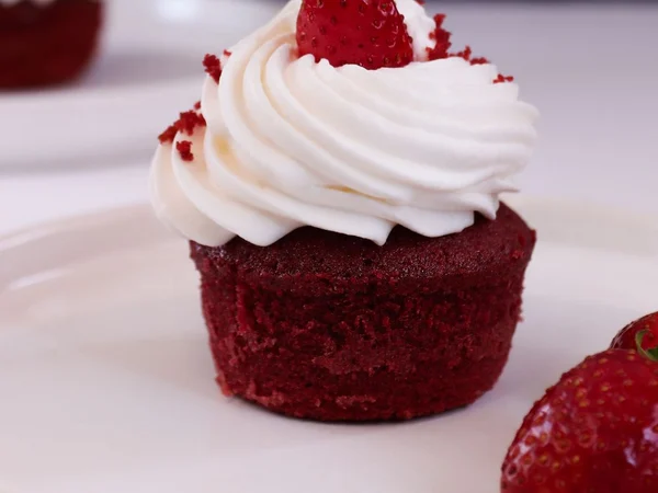
Red velvet cupcakes
Sampled from the photo
- #3F080C
- #D5C7CD
- #B0A0AB
- #82565B
Shop palette
- #CC1A27
- #EB656F
- #FBEFF0
A clear red with a light blush background; it feels confident without making every surface dark.
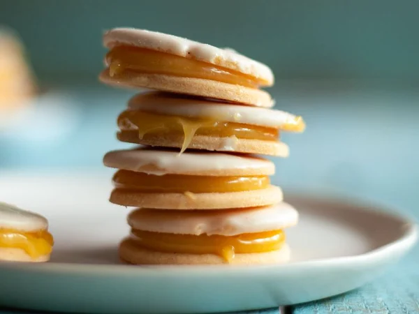
Alfajores
Sampled from the photo
- #CF923E
- #824E17
- #A0C7CF
- #DDBE93
- #2E4B47
Shop palette
- #946220
- #72BBCA
- #FCF7F1
Golden pastry and cool teal make a grounded, inviting palette for cookies and gift boxes.
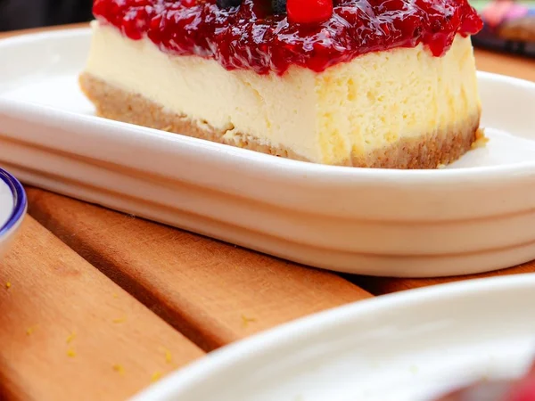
Berry cheesecake
Sampled from the photo
- #C87E4C
- #904321
- #E2C69C
- #C1483C
- #8A1B22
- #BA6F83
Shop palette
- #A05B2C
- #C0262F
- #FBF6F2
Baked crust brown with a berry-red accent; it suits cheesecakes, tarts and fruit desserts.
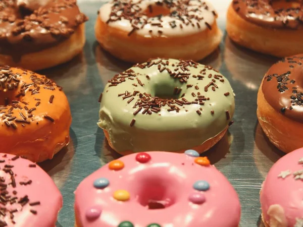
Iced donuts
Sampled from the photo
- #814324
- #E59241
- #C84B4F
- #CBBE89
- #EF9E98
- #7F7553
Shop palette
- #AA5C10
- #EAA766
- #FDF7F2
Sunny orange with a pale cream base; it gives a donut menu an easy, everyday energy.
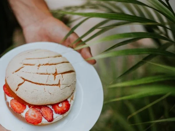
Conchas
Sampled from the photo
- #C5503B
- #293311
- #933325
- #636C46
- #BAC4CA
- #735532
Shop palette
- #B94935
- #8AAC39
- #FBF3F1
Terracotta and green bring the pastry forward; it suits a pan dulce menu with a warm, lively feel.
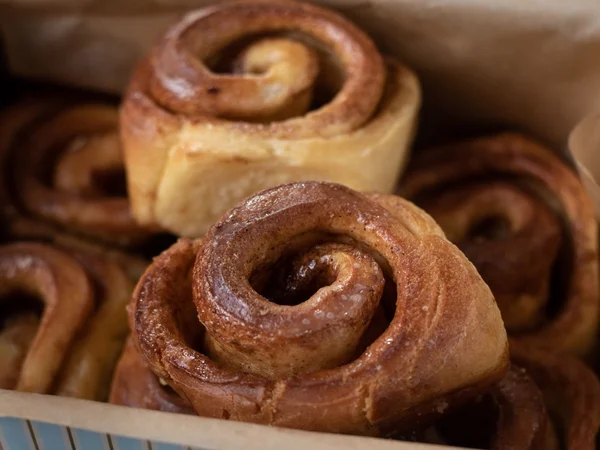
Cinnamon rolls
Sampled from the photo
- #79462A
- #3B1B0B
- #C49157
Shop palette
- #B35220
- #E4956D
- #FBF3F0
Cinnamon, toasted dough and a soft peach; warm and cozy for a weekend bake shop.
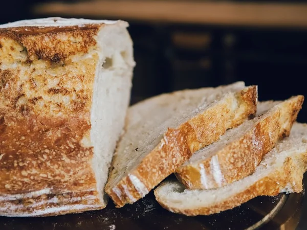
Sourdough
Sampled from the photo
- #C18C51
- #8D5A36
- #080B18
- #C9C2BA
- #382B24
Shop palette
- #9B6831
- #D1AB7F
- #FBF7F3
Earthy, quiet and dependable; it is suited to bread, brunch and a small-batch everyday menu.
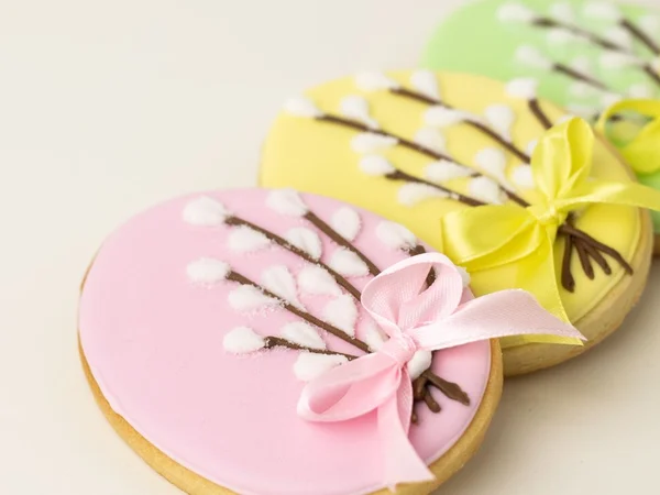
Sugar cookies
Sampled from the photo
- #DAC849
- #EBDD96
- #EFE0DB
- #F3C1CD
- #866835
- #CBA6A0
Shop palette
- #817314
- #E2D36F
- #FCFBF2
Soft yellow with a pale background; it feels bright and handmade for decorated cookies.
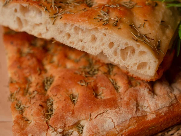
Rosemary focaccia
Sampled from the photo
- #B96834
- #8E4415
- #C29C77
- #3F1804
- #382E05
Shop palette
- #BA581B
- #E89A68
- #FBF4EF
Baked orange and peach keep the herbs and crust feeling warm; it suits savoury bakes and lunch orders.
How to pull a palette from your own photo
Pick one photo where the bake looks like the product you want people to order. Open it in a free color-picker tool or a phone editor with an eyedropper. Zoom in, tap a color and write down the hex code if the tool provides one. Do not sample only the background: the point is to carry the food into the shop.
Choose four to six colors. Start with a deep color for buttons, links and your bakery name. Add a bright accent for small highlights such as sale labels, icons or a selected state. Choose a pale page color that lets the food breathe. Finish with one or two neutrals from the bake, board or packaging so the system has somewhere quiet to rest.
Then make a tiny test: place the colors beside the photo, write your shop name in the deep color and put a white button label over it. If the colors make the bake look dull or the text disappears, sample again. A useful palette is one you can read and one that still makes you hungry.
- Deep color: buttons, links, shop name and headings.
- Bright accent: highlights, badges, small illustrations and Instagram stickers.
- Pale page color: the main shop background and label space.
- Neutral: borders, secondary text, packaging and quiet areas.
Use the colors across your shop and Instagram
A simple 60-30-10 split keeps the palette from shouting. Let roughly 60% be the page background or light neutral, 30% be the primary color in headings, buttons or blocks, and 10% be the accent. It is a proportion, not a measuring exercise. Your product photos should still take the most visual attention.
Use the same logic on Instagram: keep the accent for a price badge or launch detail, not every word in the caption graphic. On labels, use the deep color for the product name and required information, the pale color as the field behind it, and the accent for a small mark or flavor cue. Repetition is what makes a small bakery look considered.
Check contrast before you publish
Dark text on a light page is the safest default. Use white text only on a deep color that stays dark when it is printed or viewed in bright sunlight. Pale pink on cream, tan on beige and yellow on white may feel pretty in a swatch row but fail as a button or label.
Read the shop on a phone with the brightness turned down. Look at a label at its real size. If a customer has to squint, change the text color or lighten the background. Color is decoration only after the words are clear.
Common bakery palette mistakes
A trend palette can fight the food. Neon green may look exciting in a mood board and strange beside a delicate berry cake. Too many colors make every product feel like a different brand. Beige on beige hides prices, links and labels. The fix is usually smaller than a rebrand: keep the bake-led colors, choose one deep anchor, and remove the swatches that do not have a job.
- Do not choose a trend first and force your food to match it.
- Do not give every flavor its own full brand palette.
- Do not use low-contrast beige, cream or pastel text for important information.
- Do not let decorative color compete with the product photo.
The photo-to-shop version of this work
If choosing colors is the part that keeps your shop stuck in draft mode, Confita’s photo-to-shop flow does the first pass from one bake photo. In the design editor, you upload a photo; Cloudflare AI reads it, samples the colors, picks a typeface, banner style and background pattern, and suggests a shop name, tagline and menu ideas. A reveal shows the shop being built in about ten seconds.
You choose what to apply. The look can be applied, while the photo becomes the cover and the suggested name or tagline are optional checkboxes. Products, prices and orders are never changed, and one tap on Undo puts the old look back. The photo is not stored unless you use it as the cover. It is included in the plan, with no extra cost.
The three sample shops show the idea: Velvet Cherry turns a cherry cake into a red-led shop, Glaze & Grain uses teal and yellow from donuts, and Petal and Shell uses magenta from macarons. They are examples of a starting direction, not a claim that one style fits every bakery.
Keep building your bakery brand
Color is one decision. These pages help with the next ones.
Frequently asked questions
What colors are good for a bakery logo?
The best starting colors are usually visible in your food or packaging: one deep color for the name, one accent for attention and a pale neutral for space. A chocolate, bread or fruit photo will give you a more personal direction than a generic trend palette.
How many colors should a bakery palette have?
Start with three working colors: a primary, an accent and a page background. You can add one or two neutrals when you need them for borders, text or labels, but each color should have a job.
How do I make a bakery color palette from a photo?
Open a strong bake photo in a free eyedropper tool or phone editor and sample four to six colors. Choose a deep color, a bright accent, a pale page color and one or two neutrals. Test the text and buttons before you commit.
Should my bakery Instagram and website use the same colors?
They do not need identical layouts, but repeating the same primary, accent and light background helps customers recognise you. Keep product photos dominant and use the accent sparingly.
Can Confita make a shop palette from my bake photo?
Yes. Confita’s photo-to-shop flow samples the colors from one uploaded bake photo and suggests a shop look, including a typeface, banner style and background pattern. You choose what to apply, and products, prices and orders stay unchanged.