Design first, then make the order easy
A beautiful bakery site that hides the menu is still a hard site to use. A useful design does two jobs at once: it makes the baker recognisable, and it helps a hungry customer decide what to order. That means the visual choices are not decoration added after the shop is built. They are the path into the menu.
This is different from the content checklist for a home bakery website. That guide covers what the first page needs to answer: what you sell, prices, timing, and policies. This guide is about how those answers look and feel together. Read the checklist when you are deciding what to include; use these ideas when you are shaping the storefront.
1. Lead with your best photo as the cover
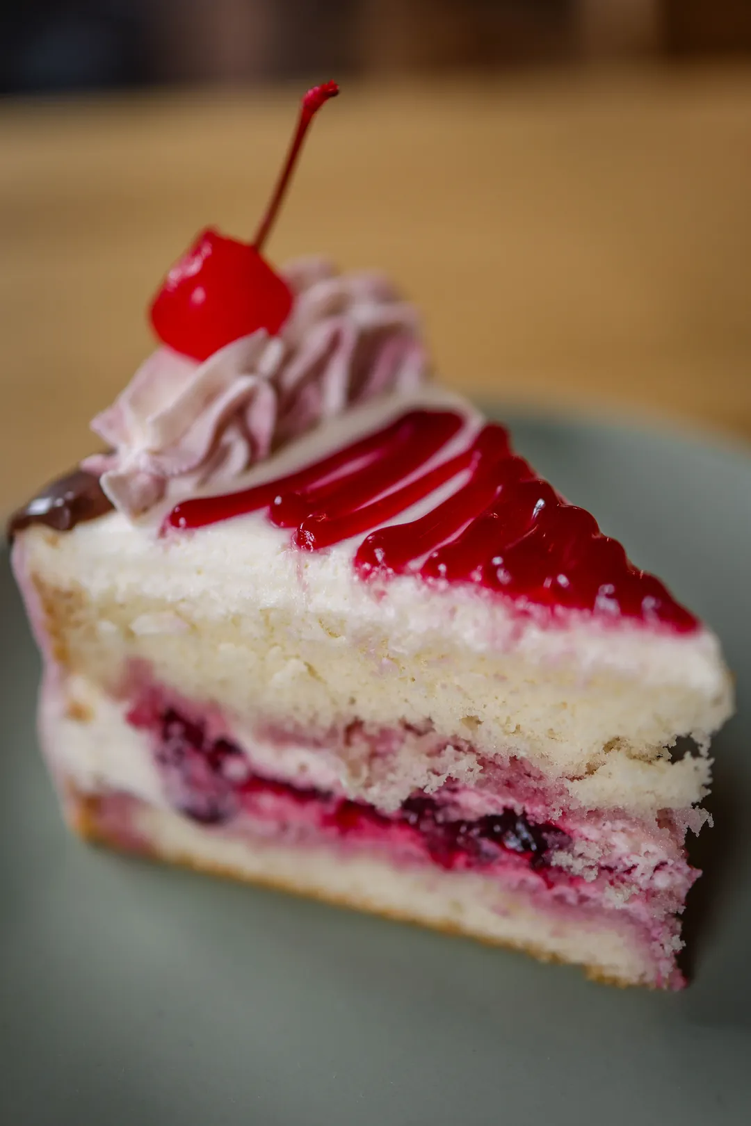
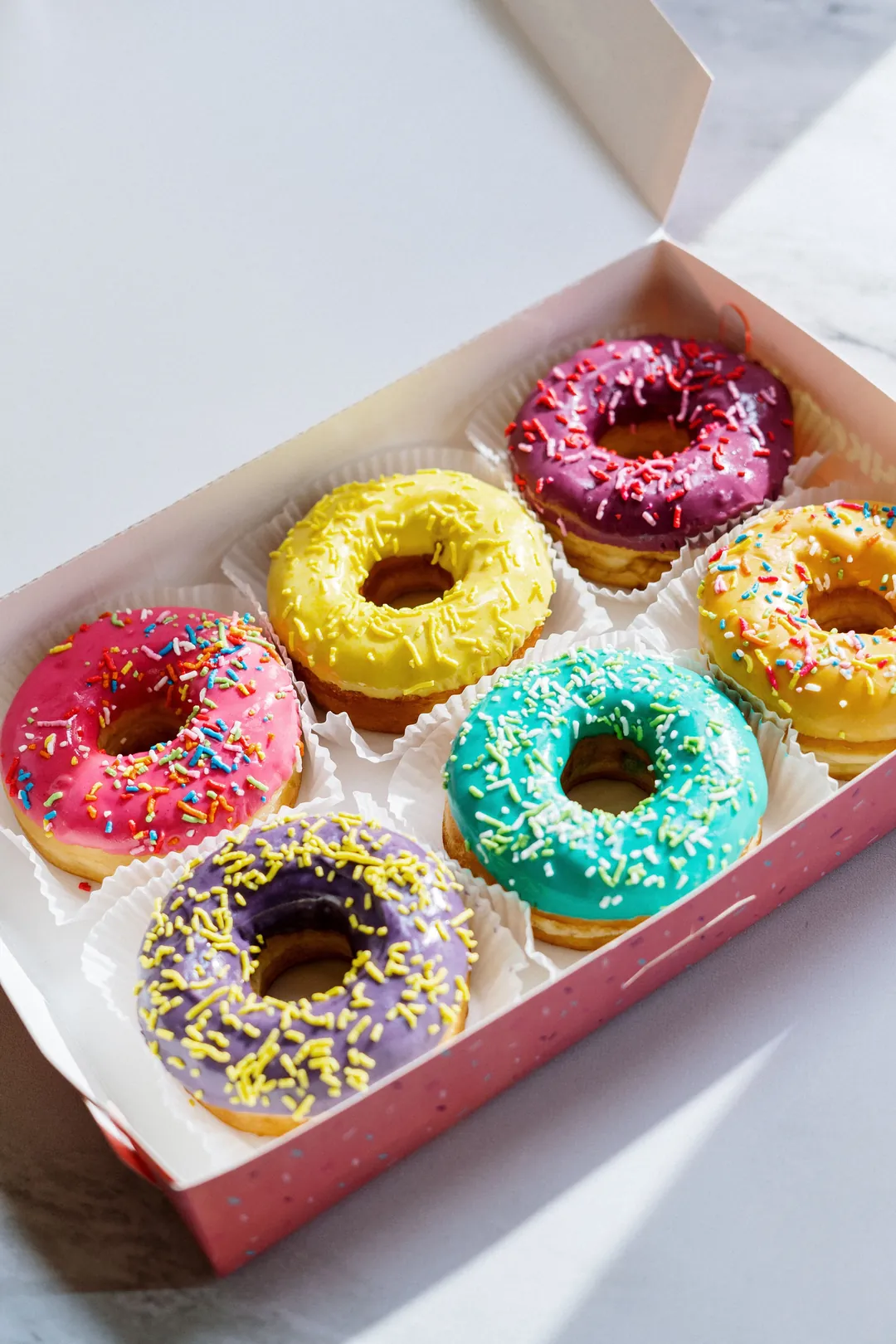
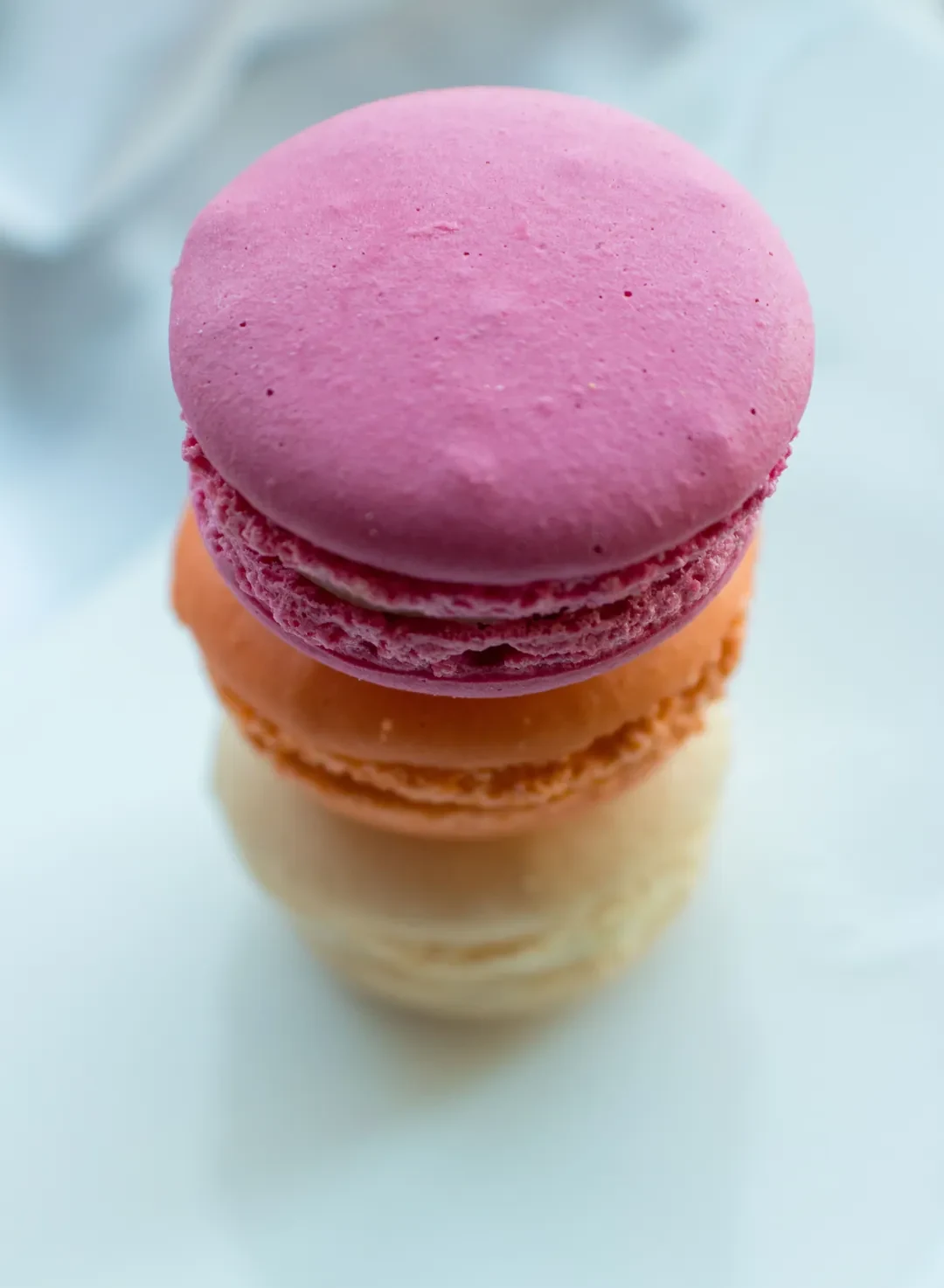
Your cover image is the fastest way to say “this is what I make.” Choose the photo that shows your signature product clearly, with enough calm space for the shop name and order button. A close photo of a cake, a box of colorful doughnuts, or a row of macarons gives the page a point of view before a customer reads a word.
Most visitors arrive from Instagram on a phone. A wide desktop crop may become a tall, tight mobile crop, so check that the main bake survives both sizes. Keep the important subject away from the edges, and do not put small text inside the image. The storefront should add the words in readable HTML text.
2. Pull the palette from your bakes
The easiest palette to trust is already in your food. A cherry cake might give you deep red, warm cream, dusty rose, and brown. Doughnuts may give you turquoise, yellow, chocolate, and icing white. Those colors feel connected because they came from the thing you sell, not from a random template.
Use one dark color for readable text, one main color for buttons and headings, and one or two accents for banners or small details. Keep the background quiet enough that product photos remain the loudest part of the page. See the bakery color palette guide for a closer look at sampling colors from a bake photo.
- Choose contrast before you choose a shade: text must remain readable in sunlight on a phone.
- Use accents repeatedly so the shop feels intentional rather than multicolored.
- Let the food photo stay warmer, brighter, or more detailed than the surrounding UI.
3. Pair one display font with a plain body font
Your bakery name can have personality; the menu should have manners. Use one display font for the name or major headings, then a plain readable body font for prices, descriptions, buttons, and policies. Two roles are enough to make the page feel designed without turning every label into a different voice.
An elegant serif such as DM Serif Display feels boutique and considered. A rounded font such as Baloo 2 feels friendly and playful. A clean font such as Manrope feels modern and precise. None is automatically better. Match the type to the product and the way you want customers to feel when they open the shop.
4. Add a banner or pattern that hints at the bakery
A small visual signature can make a plain storefront yours. A scalloped awning suggests a sweet shop. Rosette shapes can echo piped frosting. A sprinkle pattern can support a doughnut or cupcake menu. Keep the treatment at the edge of the page or behind a quiet section; the banner should frame the food, not compete with it.
Velvet Cherry uses a boutique look with a rosette banner and no background pattern, so the deep red cake palette and DM Serif Display do the talking. Glaze & Grain pairs a scallop banner with a sprinkle pattern, matching its yellow-and-teal doughnut energy. Petal and Shell uses a scallop banner with no pattern, leaving its soft magenta macaron palette and Manrope typography clean.
5. Keep the order button visible without scrolling
The cover should not be an entrance hall with no door. Put “Order now,” “Browse the menu,” or your equivalent action in the first screen. A customer who opens your link from a story may have one hand free, a weak connection, and only a few seconds. They should know what to tap without hunting through a hamburger menu.
Check this on the smallest phone you use. The shop name, short tagline, primary button, and first meaningful part of the cover need to work together. If your design pushes the button below a tall logo, a decorative quote, and a huge photo, the design is asking the customer to admire instead of buy.
6. Make menu cards do the selling
A menu card should answer the next question before the customer asks it. Show a real product photo, the product name, the price, and one short description. “Chocolate cake” is a label. “Two layers of chocolate sponge with whipped ganache” helps someone decide whether it is the cake they meant.
For a small menu, a single row or short grid is enough. For a larger menu, group products into categories such as cakes, cookies, pastries, and seasonal boxes. Keep cards consistent: the same image ratio, the same price position, and descriptions that are roughly the same length. Consistency makes a bigger menu feel easier, especially on a phone.
- Use your own photos whenever possible; customers are choosing the thing they can see.
- Put the price where the eye expects it instead of hiding it behind a tap.
- Keep the first category focused on what you most want to sell this week.
7. Show how ordering works near the menu
Design is also reassurance. Near the menu, explain the practical handoff: pickup windows, delivery area, lead time, deposits, and what happens after the order is submitted. A short strip or compact panel is enough. It gives the customer a reason to continue instead of pausing to send you a question.
The exact wording depends on your business. Say “Saturday pickup in North Park, 10 a.m.–1 p.m.” if that is the real offer. Say when a deposit is due if you take one. Do not bury these details in a footer just to keep the hero clean; a clean-looking page that creates uncertainty still loses orders.
8. Add a short about with your face or story
A home bakery is personal, and a small about section can make the storefront feel trustworthy. Use a short paragraph about what you bake, why you started, or the detail customers remember. A real face photo can help if you are comfortable sharing one. Keep it short enough that it supports the menu instead of pushing it down the page.
The goal is not a biography. It is one human reason to remember this bakery. “I bake small-batch celebration cakes with bright fruit and soft buttercream in my home kitchen” is more useful than a long statement about passion.
9. Make the shop agree with Instagram
When someone taps your bio link, the page should feel like the same bakery they just saw in a post. Reuse the main color, display font mood, photo treatment, and wording style. You do not need to make every post identical. You do need to avoid sending people from warm, handmade content to a cold, generic order form.
Use the same signature product in your profile photo, cover, and occasional menu highlight. If your Instagram is soft and minimal but your shop is loud and cartoonish, customers have to rebuild their trust at the exact moment they are ready to order.
What to skip in bakery website design
More design is not automatically better. These choices add friction, especially for the phone visitor who came from Instagram.
- Autoplay music: it surprises people in public and does nothing to explain the menu.
- Pop-ups before the customer can see a product: they interrupt the decision you want to support.
- PDF menus as the only menu: they pinch, load slowly, and hide the order action behind another file.
- Tiny text: a pretty layout is not useful if prices and pickup details need zooming.
- Ten fonts: variety makes the page harder to scan and the brand harder to remember.
Confita can start this look from one photo
If choosing colors, type, banners, and patterns is the part that keeps delaying your shop, Confita’s photo-to-shop tool can give you a coherent starting point. Upload one photo of a bake and it reads the real colors in the image, then suggests a shop look, name, tagline, and menu ideas. The three examples on this page—Velvet Cherry, Glaze & Grain, and Petal and Shell—use that same idea: a real bake first, then a storefront built around it.
You still decide what to apply. Products, prices, and orders are not changed. Every theme, font, banner, and sticker stays editable, so the first reveal is a starting point rather than a locked template. The photo is only stored if you choose to use it as the cover, and the feature is included in the plan.
- A photo gives the design a real color source.
- The visual pieces are editable after the first suggestion.
- Your product list and order data remain separate from the design change.
Keep building your bakery brand
Choose the next piece of the look, then bring it back to the shop.
Frequently asked questions
What should a bakery website homepage look like?
Lead with one strong bake photo, your bakery name, a short description, and an order button. Follow with a menu of real products showing photos and prices, then pickup or delivery details and a short about section. The design should make the next tap obvious on a phone.
How many fonts should a bakery website use?
Two font roles are usually enough: one display font for the bakery name and headings, and one plain readable font for descriptions, prices, buttons, and policies. A serif such as DM Serif Display can feel elegant, Baloo 2 can feel friendly, and Manrope can feel clean.
Should my bakery website have a PDF menu?
A PDF can be a useful extra for printing or sharing, but it should not be the only menu. A mobile storefront with real product cards, prices, and an order button is easier to browse and gives customers a direct next step.
Can I design a bakery website from a photo?
Yes. A bake photo can guide the color palette, type mood, banner, and background treatment. Confita’s photo-to-shop tool uses one photo to suggest that starting look, while keeping the theme, font, banner, and sticker editable afterward.